
Interior designer Tina Skouras layers hues for a vibrant life.
Photography by John Ellis
For Tina Skouras, an interior designer and former fashion editor, every home is a canvas waiting to reveal the character of the homeowner. But the challenge took on a new twist for her in the Pacific Northwest, where more color often equals more joy.
“An abundance of color can really improve your mood here,” Skouras says. “Rooms can be an organic extension of the homeowner’s interests, travels and personal expression — in all their colorful glory.”
Skouras is more than up to the task. After moving to Portland to raise her two children following a career as a features editor for Vanity Fair, she began her design venture by shaping her new home — transforming the historic property into a showcase of her colorful, layered style.
Skouras grew up under the wing of her mother, Patti Skouras, interior designer to California’s elite. After managing her mother’s antiques and decorative furnishings store on Melrose Avenue, the younger Skouras ventured into television, working behind the scenes on David Lynch’s iconic show, Twin Peaks. When the show wrapped, she relocated to New York. Starting with a stint at the world-renowned Gagosian Gallery, Skouras segued to Vanity Fair, producing Hollywood and celebrity features, eventually moving to their fashion department. But interior design was in her blood.
“There’s not a big leap between fashion and interiors,” Skouras says. “Everything that’s happening in fashion, art and interior design informs each other.”
Transitioning to Portland to raise a family, Skouras went back into business with her mother, designing homes up and down the West Coast — in a range of styles from California contemporary to Italian villa-inspired. The design duo’s eclectic but timeless visual voice comes to full, vibrant life on the canvas of Skouras’ own Portland Heights home.
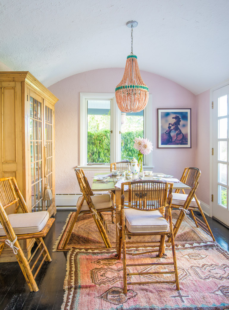
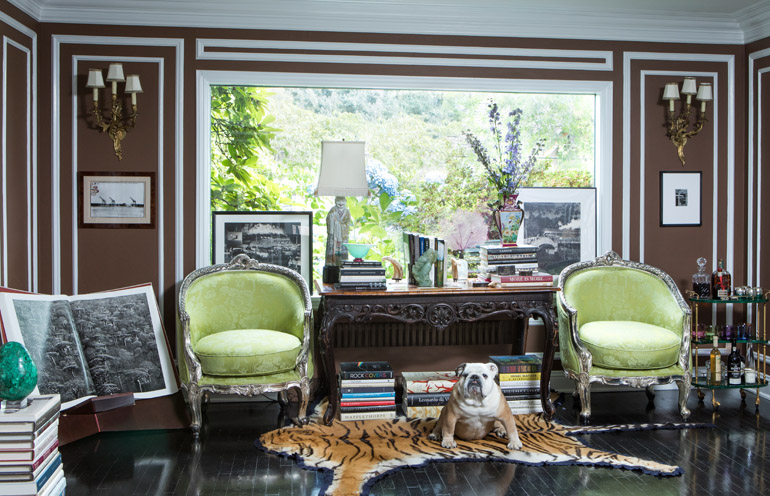
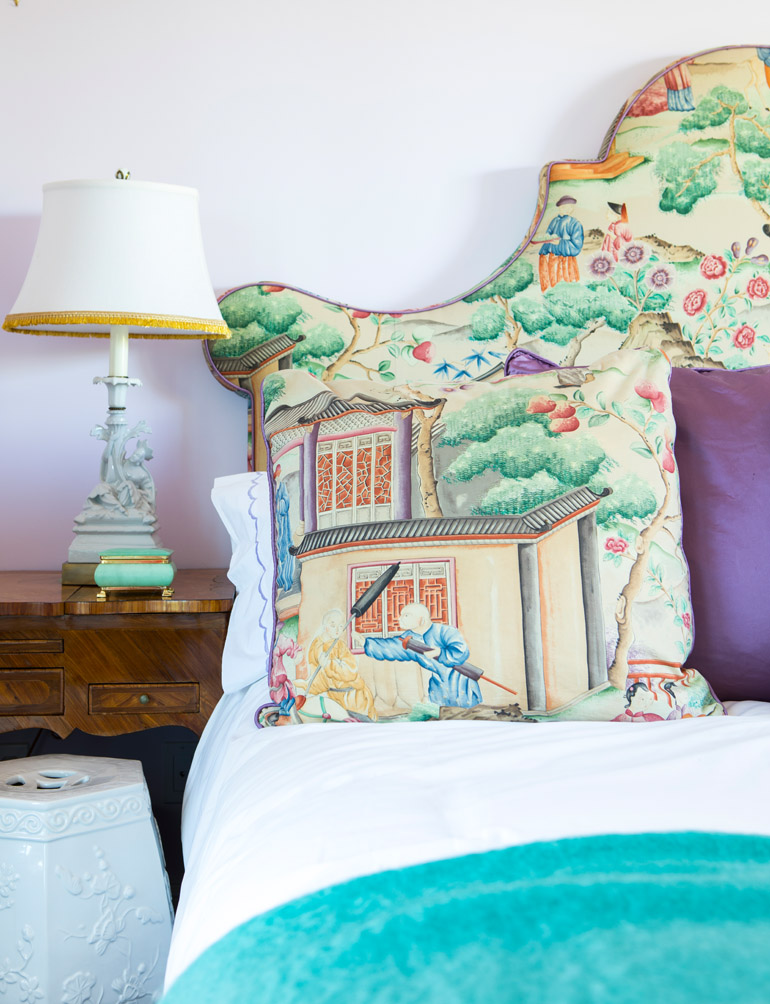
Skouras’ colorful take on classical French interiors draws from the golden years of Hollywood glamour, mixed with rich hues that wouldn’t be out of place on the Versace catwalk. Timeless, quality vintage and new pieces are mixed and layered with texture and pattern in a saturated palette.
“I still love fashion, and my work with fabrics, upholstery and furniture is an expression of that,” Skouras says. “One of the most fabulous aspects of high fashion is how extravagant, layered and detailed it can be. The most minimalist-appearing garment can be the most detailed and specific in its construction. That is an edict I bring to how I create interiors.”
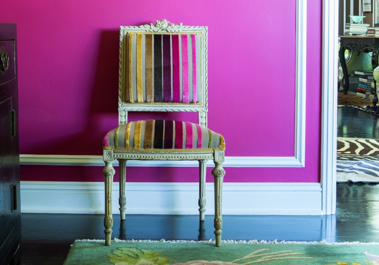
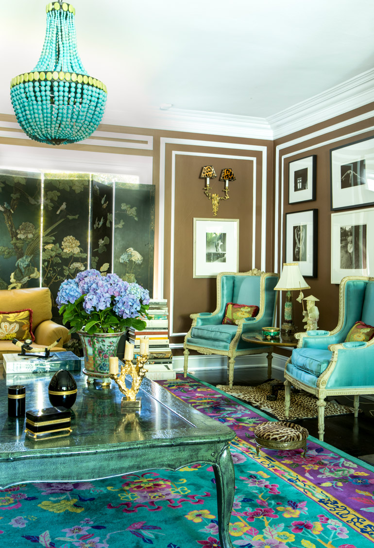
For her own home, Skouras let vibrant Chinese rugs be her muse to set the palette of each room. The chocolate walls of the sitting room ground the space in an unexpected neutral backdrop that’s the opposite of boring. The deeper color provides a contrast to the ornate moldings, giving them extra visual pop. The rug’s colors — a sea of turquoise embellished with gold, purple and fuchsia florals — provide a wide range from which to choose complementary accessories. A custom turquoise chandelier — the creation of Skouras’ sister, Marjorie, an interior and furniture designer in her own right — adds drama and another pop of color. Skouras balances all this color with other careful choices, like black and white photography to bring interest and richness without competing with the rest of the room.
Understanding color theory and complementary color combinations is vital to pulling off a layered and varied approach to interior design, Skouras says. The designer gave scrupulous attention to room to room transitions, and spaces where more than one room can be in eyesight at the same time. Even objects of decor can move from room-to-room without looking out of place. It’s a philosophy Skouras inherited from her mother, who believes you should be able to pick up something from one room, move it to another room and have it work seamlessly.
“Our homes are a work in progress — a living, evolving place that evolves as we evolve,” Skouras says. “Even wild and colorful choices can be made with a holistic approach.”
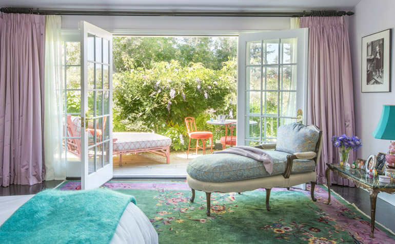
Embracing color, Skouras says, means starting slow and building up. She recommends beginning with the wall color to set the tone for a room without making a huge investment. From there, she says, work up through accessories and objets d’art. Layering rooms with complementary colors, textures and periods expresses personality and originality while remaining warm and inviting.
Skouras enjoyed applying her ideas about light, color and landscape to her new space. It’s an approach she applies to all of her projects — choosing colors that both reflect and complement the natural light of a space and the landscape that surrounds it. She’s currently designing a home in the California desert that riffs on shades of aqua, a cooling antidote to the sunbaked view of sand and stone.
“I feel so much at home in interior design,” says Skouras.
A Personal Palette
Tina Skouras’ tips for decorating with color
- Timelessness. Stick with a timeless design that won’t date itself in 10 years regardless of color.
- Wonder walls. The least expensive and most straightforward thing to change is wall paint color.
- Embrace play. Experiment on one room in your home before going all-in.
- Get inspired. If you feel uncertain with how to proceed, there are endless online resources to see how others are using color and what combinations inspire you.
- Love the layers. Start with throw pillows and build up from there, adding accessories with color.
- Follow nature. Look outdoors for your inspiration; it contains endless color combinations that never look wrong.
- Start small. A little bit of color goes a long way.
- Work with your stuff. If you’re a collector of things, those collections can inspire a whole room.